Adding a LogicMonitor graph to your report is easy, and works for HTML, DOCX (Word), PDF and PPTX (PowerPoint).
Let’s use Report Studio and go through the examples from the in-built ReportMagic help system. To follow along, simply:
- Click on Report Studio
- Click “Insert Macro”
- Search for “LogicMonitor.Graph”
- Insert each example, modifying the “device” parameter to refer to a device in your environment
Example 1: The basics
[LogicMonitor.Graph:
    device=dev.panoramicdata.com,
    graphName=CPU Usage,
    dataSourceInstanceName=WinCPU
]
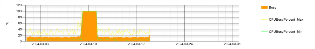
Let’s break down the parameters:
-
device: this selects the device (or “resource”) by Display Name, which is always unique in a LogicMonitor portal. Note that this is not the same as “hostname” (IP address or DNS entry) as these a NOT unique in LogicMonitor. You can also use deviceId instead.
-
dataSourceInstanceName: this selects the DataSource AND instance name. For a single-instance DataSource like WinCPU, this is simply the DataSource name.
-
graphName: a DataSource may have multiple graphs, so this selects which graph we are using. The Graph’s unique name is used, not the display name. You can also use graphId.
Easy! The colors used are those used by LogicMonitor. What if we wanted to change that?
Example 2: Modifying the palette and y axis label format
[LogicMonitor.Graph:
    device=dev.panoramicdata.com,
    graphName=CPU Usage,
    dataSourceInstanceName=WinCPU,
    palette=Busy^#f84589,
    yAxisLabelFormat="00.00"
]
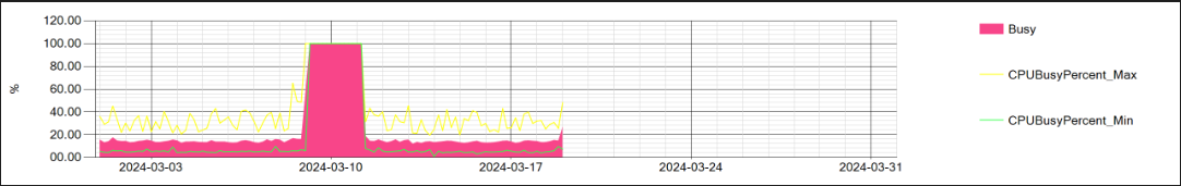
In this example, we have modified the look and feel slightly with the following parameters:
-
palette=Busy^#f84589: Any line referenced by the palette parameter is modified. Any line not referenced will continue to use the LogicMonitor default palette for that graph. In this example, we are modifying the Busy line to be pinkish. You can add more as follows: Line1Name^Color1;Line2Name^Color2;Line3Name^Color3… You can also use any System.Drawing.Color color name from this list: Brushes Class (System.Windows.Media) | Microsoft Learn or specify the color in #RGB, for example: #b9b
-
yAxisLabelFormat: Here we are enforcing at least two figures before and after the decimal point using standard or custom .NET number formatting. You can read more here: Standard numeric format strings - .NET | Microsoft Learn and here: Custom numeric format strings - .NET | Microsoft Learn
Example 3: Fixed lines
[LogicMonitor.Graph:
    device=dev.panoramicdata.com,
    graphName=CPU Usage,dataSourceInstanceName=WinCPU,
    fixedLines=10%^10^LimeGreen;90%^90^LightCoral
]
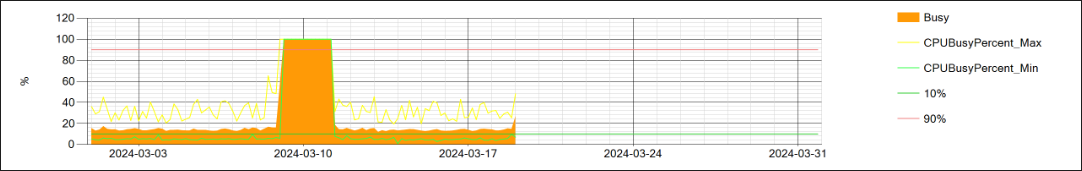
Here, we have added fixed y-value lines to the graph, for example to demonstrate upper and lower limits, using the parameter:
- fixedLines=10%^10^LimeGreen;90%^90^LightCoral
Note how we provide three parameters for each line: the label (shown in the legend on the right), the value and the color.
Example 4: including only specific data points
[LogicMonitor.Graph:
    device=dev.panoramicdata.com,
    graphName=Queue Length,
    dataSourceInstanceName=WinCPU,
    includeDataPoint=Queue Length
]
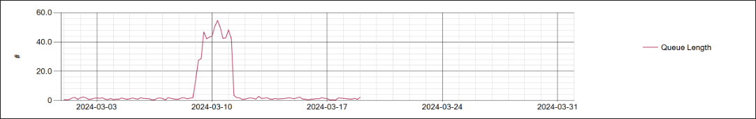
Here, we have chosen to only show one of the available lines on the graph using the parameter:
- includeDataPoint=Queue Length
You can choose to include OR exclude specific lines.
Example 5: Custom Y Axis label
[LogicMonitor.Graph:
    device=dev.panoramicdata.com,
    graphName=CPU Usage,
    dataSourceInstanceName=WinCPU,
    yAxisLabel=Custom Y Axis Label
]
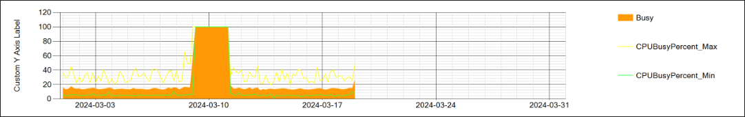
Here, we override LogicMonitor’s default Y Axis label.
There are many other parameters demonstrated by help examples. Let’s skip ahead to forecasting:
Example 9: Forecasting
[LogicMonitor.Graph:
    device=dev.panoramicdata.com,
    forecast=true,
    forecastTrainingTime=3months,
    forecastTime=1month,
    graphName=CPU Usage,
    dataSourceInstanceName=WinCPU,
    includeDataPoint=CPUBusyPercent
]
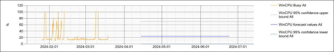
In this example, we use LogicMonitor’s built-in time series forecasting capability to project future CPU usage for a month into the future. [We modified the standard training and forecast time to 3 months.]
Example 12: Netflow data
[LogicMonitor.Graph:
    device=PDL-PVG-PROD-01,
    type=NetflowBandwidth,
    startDate=2024-03-31,
    endDate=2024-04-01,
    chartHeight=1500
]
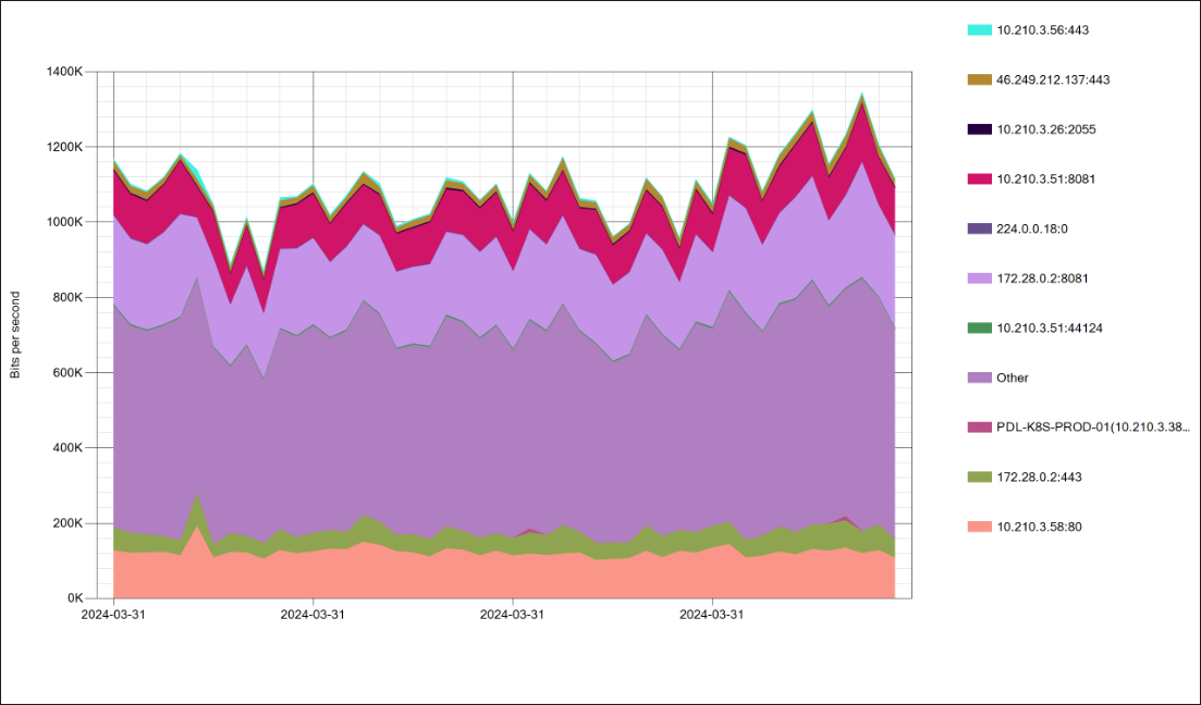
Wondering what’s using all that bandwidth? Adding a graph to your monthly customer reports is as easy as that! [We have modified the start and end dates for the help example to just show data for one day and adjusted the chart height
Conclusion
Adding LogicMonitor graphs to your custom reports is easy. We have just touched on the possibilities here - it’s also possible to:
- include lines from multiple devices or multiple instances into a single graph
- aggregate such lines at the instance or device level
- exclude periods of Scheduled Down Time (SDT)
- obtain aggregates as summary values using the [LogicMonitor.SummaryValue:] or [LogicMonitor.SummaryValueList:] macros, incluing first, last, mean, min, max, centiles, percentConditionMet and many more
Let us know if we can help you with YOUR LogicMonitor graphing and reporting requirements ![]()