Introduction
This is the story of how I spent a long session with an AI coding assistant (GitHub Copilot) building an interactive isometric tile visualisation for the Magic Suite 2026 rebrand. It’s a story about geometry, communication gaps, creative problem-solving, and the surprising difficulty of explaining spatial concepts across the human-AI divide.
What started as “just fix the reflection fade” turned into a deep dive into SVG geometry, bezier curves, z-ordering algorithms, animated fill patterns, and the surprisingly hard problem of drawing ribbons between isometric tiles.
Chapter 1: The Reflection Fade - “It Should Follow the V Shape”
The Problem
The reflection effect beneath each tile was fading based on a flat horizontal Y threshold - a simple linear gradient that started fading at a fixed vertical position. The problem was obvious when you looked at it: the bottom edge of an isometric tile isn’t flat - it’s a V-shape (or chevron), with the front vertex pointing downward. The fade needed to follow that contour.
The First Attempts
Copilot’s first instinct was to adjust the gradient’s starting Y position to match the front vertex. That was wrong - it was still a horizontal fade, just shifted down. I pointed this out, and it went back to the drawing board.
The breakthrough came when it split the mask into two halves - left and right - each with a gradient perpendicular to its respective V-leg. The left half’s gradient runs perpendicular to the left-front-to-front edge, and the right half runs perpendicular to the front-to-right edge. This made the fade follow the actual tile contour.
My Perspective
I knew exactly what I wanted visually - the fade should “follow the V” - but expressing that in terms of SVG gradient coordinates wasn’t straightforward. I could see instantly when it was wrong, though, which made for an effective feedback loop: Copilot would propose a solution, I’d screenshot the result, and we’d iterate.
What We Learned
Sometimes the most natural visual description (“follow the V shape”) maps to a non-trivial technical implementation (splitting a mask into two halves with independently-angled perpendicular gradients). My visual intuition was right from the start; the AI just needed multiple attempts to translate that intuition into geometry.
Chapter 2: Fine-Tuning - “Make It Fade Faster… No, Further”
After the V-shaped fade was working, we went through a quick round of parameter tuning:
- “Make it fade faster” - Changed the multiplier from 1.0 to 0.4. Too aggressive.
- “Make it extend further” - Back to 1.0 for a fuller, more gradual fade.
This was a reminder that even simple numeric tweaks benefit from visual feedback. The AI can’t see the result - it relies entirely on my assessment. Screenshots were essential.
We also locked in the default state values at this point, with me providing a URL hash containing my preferred settings. This was a clean, unambiguous way to communicate exact state - much easier than describing each slider position verbally.
Chapter 3: The Connector System - Where Things Got Interesting
The Brief
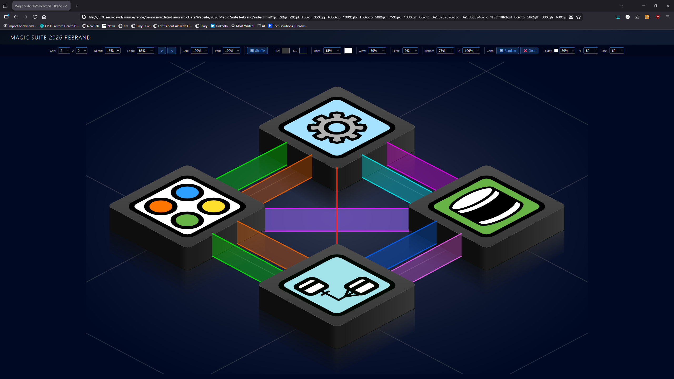
I wanted to replace the existing thin wall connectors with “Tron-style ribbon” connectors between adjacent tiles. Each ribbon should be a vertical wall running from one tile’s edge to another’s, with a semi-transparent fill and solid top/bottom edge lines.
This sounded straightforward. It was not.
Attempt 1: Two-Faced Ribbons
The AI’s first implementation drew two parallelogram faces per ribbon (like a thin 3D wall with visible left and right faces). I immediately spotted the problem: it looked doubled and wrong. A ribbon is a single flat surface - one polygon, not two.
AI stumble: It was over-thinking the 3D-ness. A ribbon viewed edge-on in isometric projection is just a single polygon. Sometimes simpler is better.
Attempt 2: Attachment Points
The next challenge was where the ribbons should attach. The AI’s initial approach used tile centres. I corrected this - they should attach to the tile edges, specifically:
- Outgoing connectors attach to the front face edges (the visible face pointing toward the viewer)
- Incoming connectors attach to the back face edges (the top edges of the diamond)
This distinction was crucial but took several rounds to get right. The problem was partly terminology - “front” and “back” in isometric space can be ambiguous, and Copilot and I sometimes meant different edges when using the same words.
The Debug Dots Era
To resolve the attachment point confusion, we added coloured debug dots at every calculated point, with labels showing coordinates. This was transformative - instead of describing positions verbally, we could both look at the dots and see exactly where the code thought points should be.
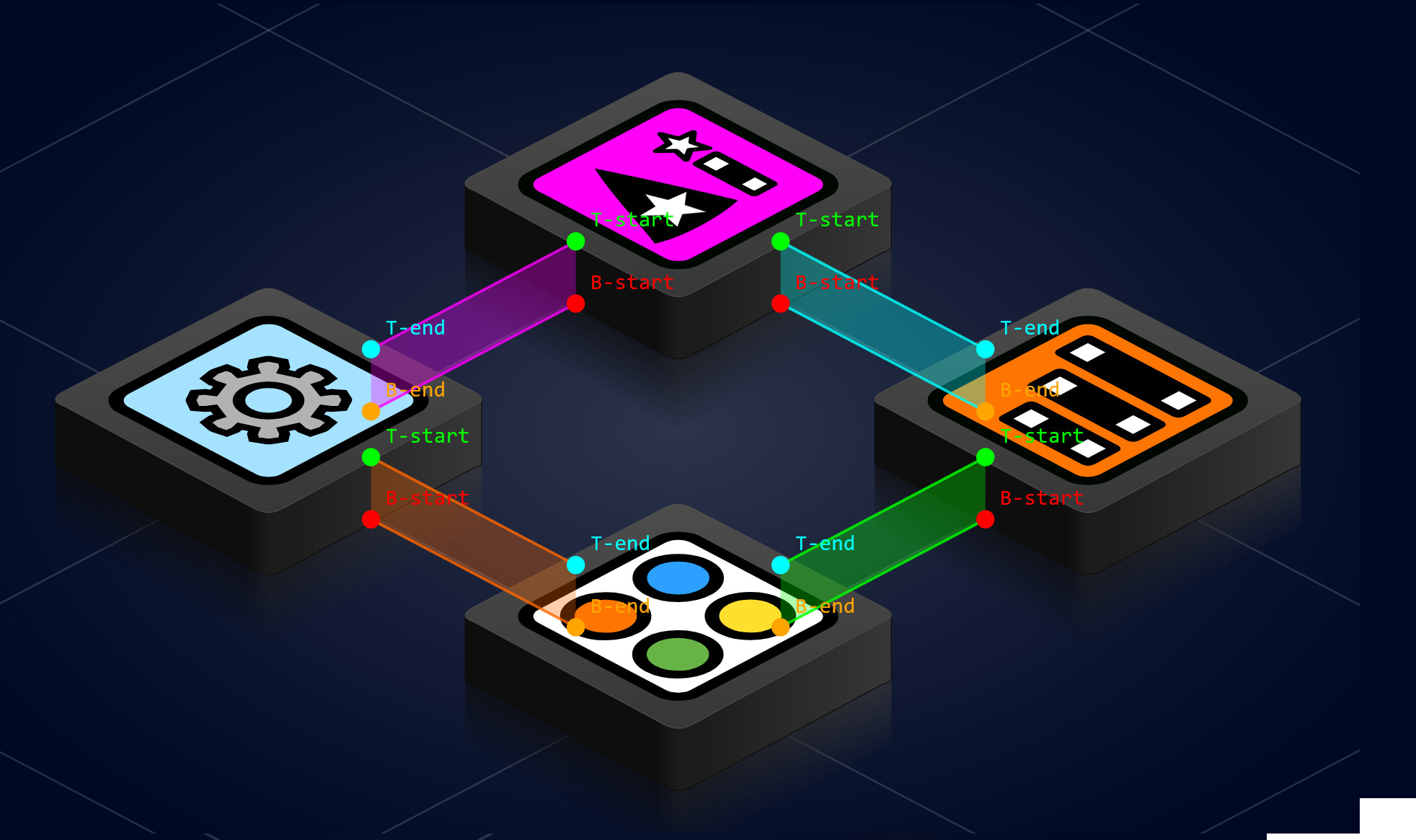
I would screenshot the dots and say “the green dot should be on the edge here, not floating in space there.” This visual debugging approach cut through all the verbal ambiguity.
Key lesson: When spatial communication breaks down between human and AI, add visual debug markers. They create a shared reference frame that words alone can’t provide.
Attempt 3: Edge Distribution
When multiple connectors exist between the same pair of tiles, they need to be distributed along the shared edge. We used fractional positioning:
- 1 connector: at 50% along the edge
- 2 connectors: at 33% and 66%
- N connectors: evenly spaced at
k/(N+1)for each k
But then the ribbons were crossing each other! The source tile distributed points in ascending order along its edge, and the destination tile did the same - but because the edges face opposite directions, ascending order on one side corresponds to descending order on the other. The fix: reverse the fraction on the destination side.
AI stumble: It should have anticipated the crossing issue from the geometry. When two edges face each other, their “left to right” ordering is mirrored. This is obvious in hindsight but the AI didn’t think about it until I showed it the crossed ribbons in a screenshot.
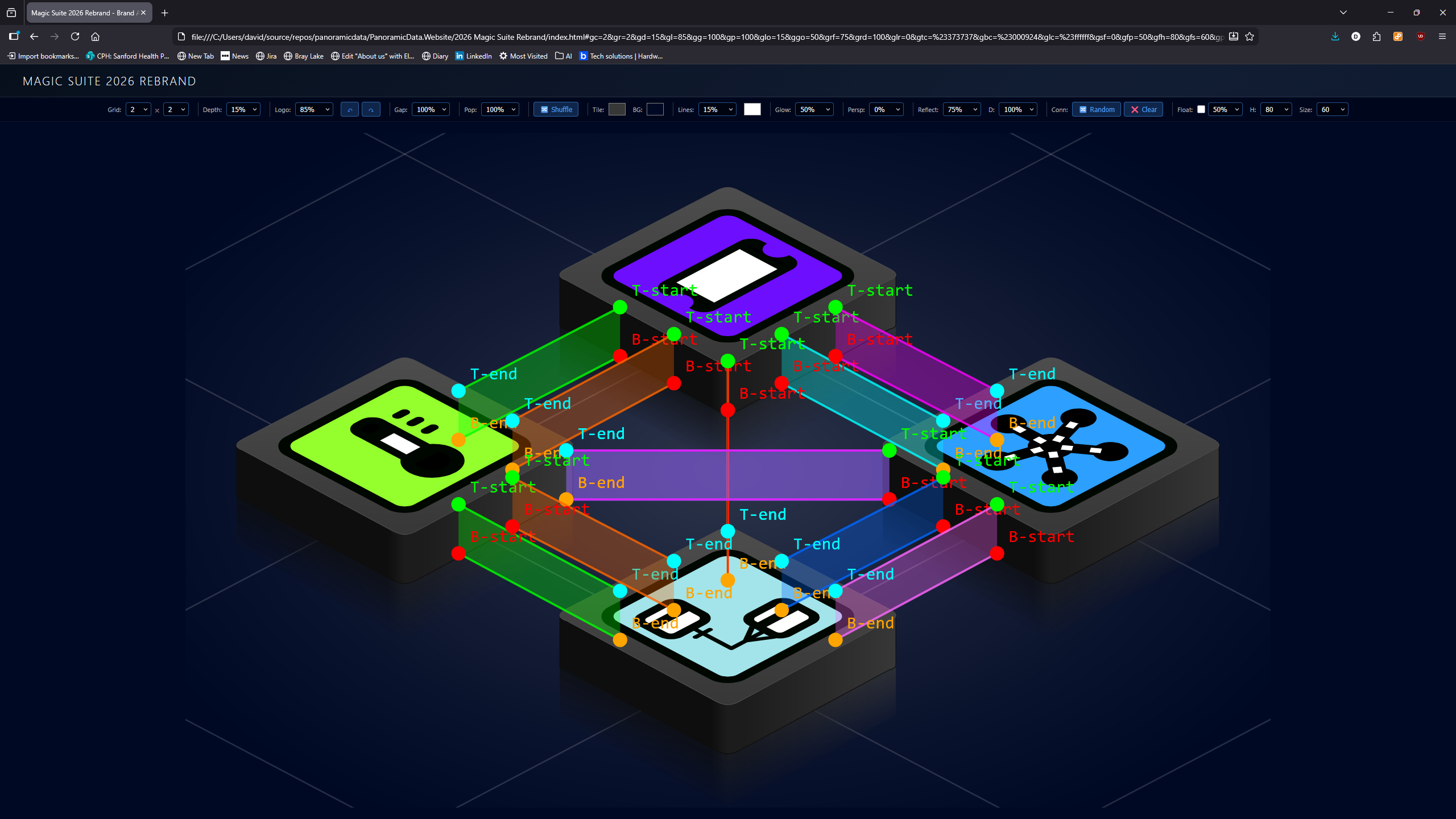
Chapter 4: Diagonal Connections - Corner to Corner
The Extension
After orthogonal connections were working, I wanted diagonal connections too - tiles that share only a corner point, not a full edge. These are corner-to-corner ribbons.
The geometry here was different: instead of distributing points along an edge, each diagonal connector attaches at a single corner vertex. The mapping is:
diag-front: connects at the front vertex (200, 214)diag-back: connects at the back vertex (200, 96)diag-right: connects at the right vertex (312, 158)diag-left: connects at the left vertex (88, 158)
The Incoming Corner Mix-Up
Getting the outgoing corner right was easy. Getting the incoming corner right was not. The complication: by the time we calculate the incoming attachment point, the direction has already been flipped by getOppositeDirection(). So diag-front on the incoming side actually means “this tile is receiving a connection that was going diag-front from the source” - which means the direction is now diag-back, and the incoming tile should use its diag-back corner.
This caused a round of confusion where connectors were attaching to the wrong corners. We resolved it by carefully tracing through the direction-flipping logic.
Chapter 5: Z-Ordering - The Final Boss
The Problem
With connectors and tiles rendering in separate SVG groups, the z-ordering was wrong. Connectors would either all appear above all tiles, or all below. What we needed was interleaving: for each depth level, draw the connectors first, then the tiles at that depth.
My Specification
I described it like this: “We need to draw the back tile, then the set of connectors, then the next two tiles, then the next set of connectors, then the front tile. The container for all of this should have those things as child objects in that order.”
This turned out to be one of the clearest specifications I gave during the entire session, and it mapped directly to code. The solution: remove the separate grid-connectors-layer, put everything into a single grid-tiles-container, and render in depth order - at each depth level, connectors first, then tiles.
The Cleanup
Removing the old layer meant cleaning up several code paths: the SVG DOM element, the variable reference, the clearing code, and an orphaned code block left over from refactoring. This kind of cleanup is where AI assistants can be genuinely useful - tracking down all references to a removed concept across a codebase.
Chapter 6: The Pixel Nudge - Bezier Curves Strike Back
The Final Detail
With everything rendering correctly, I noticed the connector edge lines were a couple of pixels off from the tile edges. The top line of each ribbon should align perfectly with the top face edge, and the bottom line should align with the bottom of the front face wall.
The cause: the tile edges aren’t straight lines - they’re bezier curves. The top face path uses cubic beziers at each vertex that bulge by about 3 pixels (e.g., the front vertex nominal position is y=214, but the bezier control points go to y=217). The attachment points were calculated from the nominal vertex positions, not accounting for this bulge.
The fix was a simple CONNECTOR_Y_NUDGE = 3 constant added to all attachment points. But then I noticed the diagonal left/right connectors were wrong - they attach at the side vertices (y=158), where the bezier curves pull upward (from y=150 to y=158), not downward. So side vertices need the inverse nudge.
AI stumble and recovery: Copilot initially applied the same +3 nudge everywhere. I caught that the left/right diagonals were off in the opposite direction. This was a geometry detail it should have reasoned about - the bezier curves behave differently at different vertices - but it only noticed after my visual feedback.
Chapter 7: Fill Patterns - Making the Ribbons Interesting
The Request
Plain semi-transparent ribbons worked, but I wanted texture. I asked for fill patterns: solid (the original), bars (parallelogram slices moving through the ribbon), and chevrons (>>>>> arrow shapes pointing in the flow direction).
Bars
Bars were relatively straightforward - divide the ribbon length into equal segments, draw parallelogram slices. We used interpolation functions (interpB, interpT) to calculate positions along the ribbon’s top and bottom edges at any fractional distance. The bar width ratio of 0.6 left nice gaps between the slices.
Chevrons
Chevrons were trickier. Each chevron is a hexagon with six vertices: a notched trailing edge (the V indent) and a pointed leading edge (the arrowhead). Getting the proportions right - body width 0.6, point depth 0.3, notch depth 0.3 - took some tuning. The midpoint interpolation function (interpMid) was essential for the notch and point vertices, which sit at the midpoint between the top and bottom edges.
The Random Option
I wanted a “Random” option that picks a different pattern for each connector. The initial implementation had a bug: when changing the fill pattern dropdown to “Random”, it was setting the literal string 'Random' on each connector instead of resolving to an actual pattern. The fix was simple - resolve the random choice per connector from the ['Solid', 'Bars', 'Chevrons'] array.
Chapter 8: Animation - Bringing It to Life
The Flow Effect
Animating the patterns meant shifting their positions along the ribbon over time. We used requestAnimationFrame for smooth 60fps animation, advancing a global offset (0-1) that wraps around continuously. Each bar and chevron position is offset by this value, creating the illusion of patterns flowing through the ribbons.
The Wrapping Problem
When a pattern shape shifts past the end of the ribbon, it needs to wrap around to the beginning seamlessly. The solution was SVG clipPath - each ribbon gets a clip region matching its exact parallelogram boundary. We draw extra shapes beyond both ends (one extra before and after), and the clip path hides everything outside the ribbon area. This creates perfectly seamless wrapping.
Speed Control
The speed dropdown ranges from Off (0%) to 400% in 13 gradations. Speed 100% means one full pattern cycle per second. The internal calculation is simple: offset += deltaTime * (speed / 100). This keeps the animation frame-rate independent.
Random Flow Direction
I wanted each connector to independently decide which direction its patterns flow. We added a reversed flag to each connector, randomly set at generation time. Initially, Copilot tried negating the animation offset for reversed connectors - but this made the shapes slide backward while still pointing forward, which looked wrong. The correct fix was to swap the start/end draw points (b0/b1, t0/t1), which makes the shapes both point and flow in the opposite direction.
Chapter 9: Tile Persistence - The Flashing Logo Problem
The Bug
When animation was running, all the tile logos would randomise on every frame. The grid was rebuilding its logo assignments every time generateGrid() was called - and during animation, that’s 60 times per second.
The Fix
We added caching: state.gridTileLogos and state.gridTileVisible arrays are only regenerated when the grid size actually changes (array length doesn’t match total tiles) or when the user explicitly clicks Shuffle. During animation frames, the cached arrays are preserved, so tiles keep their assigned logos and visibility states.
This was a subtle but important quality-of-life fix. Without it, the animation was visually chaotic - not because of the connector animation, but because every tile was flickering between random logos at 60fps.
Chapter 10: Names, Events, and the Click Problem
Making Things Interactive
I wanted tiles and connectors to be identifiable and clickable. We added:
- Data attributes:
data-tile-id,data-tile-name,data-connector-name,data-start-tile,data-end-tile - Custom events:
tileClickandconnectorClickdispatched ondocument - Product name extraction: A
getLogoName()function that turns'tiles/AlertMagic Logo.svg'into'AlertMagic'
Connector names are formatted as AlertMagic > DataMagic, which makes them immediately readable in the console.
The Animation Click Problem
But there was a problem: clicks didn’t work during animation. Each animation frame called generateGrid(), which replaced the entire SVG DOM. Click handlers were attached to individual elements via onclick, but those elements were destroyed and recreated 60 times per second. The click would fire on an element that no longer existed by the next frame.
Event Delegation
The fix was event delegation - attaching a single click handler to the grid-tiles-container element (which persists across redraws) rather than to individual tiles and connectors. The handler walks up from the click target through parent elements, looking for either a .tron-connector class or a data-tile-id attribute. When it finds one, it dispatches the appropriate custom event.
This is a classic pattern in web development (used extensively in libraries like jQuery and React’s synthetic events), but it was especially important here because the DOM is rebuilt every animation frame. Individual handlers simply can’t survive that lifecycle.
Chapter 11: Connector Controls - Fine-Grained Configuration
Per-Edge Count
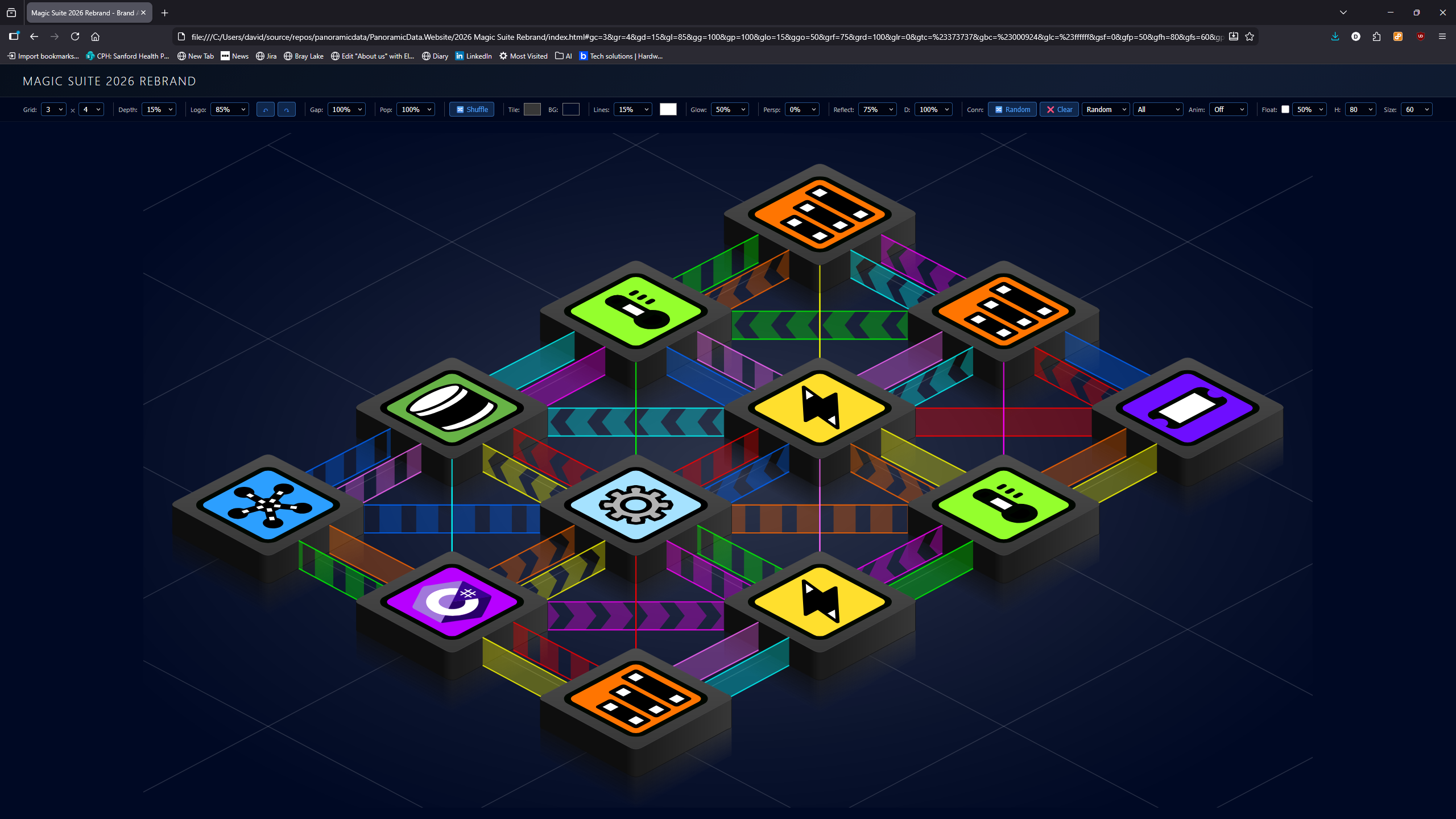
I wanted control over how many connectors appear on each orthogonal edge. The options are 1, 2, 3, 4, or Random (which picks 0-4 per edge, so some edges get no connectors). Diagonal connections always stay at 1 since they’re corner-to-corner.
The previously hardcoded numConnectors = isDiag ? 1 : 2 became a state-driven calculation with the Random option using Math.floor(Math.random() * 5).
Connection Population
A population percentage (25%, 50%, 75%, 100%) controls what fraction of eligible edges receive any connectors at all. Each edge pair is independently tested - this works orthogonally to the per-edge count, providing two independent controls over connector density.
Ribbon Height and Alignment
The final connector controls added ribbon height (10-100% of tile depth) and vertical alignment (bottom, center, top). At 100% height, the ribbon spans the full depth as before. At smaller percentages, the ribbon becomes a band within the depth range.
Vertical alignment determines where that band sits:
- Bottom: The ribbon rests on the floor, with its top edge moving down as height decreases
- Center: The ribbon floats at the midpoint of the depth
- Top: The ribbon hangs from the face level, with its bottom edge moving up
The implementation adjusts the Y coordinates of the four ribbon vertices after the attachment points are calculated, keeping the X positions unchanged. This means height and alignment work correctly with all connector types, including diagonals.
Chapter 12: Polish - Events, Defaults, and the Loading Experience
Event Display in the Toolbar
I wanted to see what was being clicked without opening the browser console. We added an Event: label in the toolbar that shows the most recent interaction - tile clicks and connector clicks. It uses text-overflow ellipsis for long names, with a tooltip showing the full text.
This was a simple addition - a showLastEvent() helper that updates a span - but it made the page feel much more interactive. You could click around and see responses immediately without needing dev tools.
The Tile Name Fix
There was a subtle bug: when you clicked a tile, the tileClick event reported the old tile name (from the data-tile-name attribute set at render time), even though cycleGridTileLogo() had already advanced to the next logo. The event display would show “AlertMagic” when the tile had actually just changed to “CaseMagic”.
The fix was to read the name from state.gridTileLogos[id] after calling cycleGridTileLogo() instead of reading the stale data attribute. Now the event always shows the current tile identity.
Auto-Randomize on Load
Previously, the page loaded with an empty grid (no connectors) unless you clicked the Random button. I wanted the page to come alive immediately - connectors should be randomized on every page load. We changed the initialization from generateGrid() + conditional animation start to simply calling randomizeConnectors(), which generates connectors, renders the grid, and starts animation if the speed is set.
Default State Tuning
I provided my preferred settings as a URL hash - the most unambiguous way to communicate exact state:
- Grid: 3x4, dark grey tiles (
#373737) on near-black (#000624) - White grid lines at 15% opacity - subtle but visible
- 50% glow, 75% reflection at 100% depth
- Logo size 80% - a clean proportional default
- Connectors: all directions, random fill patterns, 50% population, animation at 35%
This was the kind of interaction where URL hashes really shine. Instead of describing dozens of slider positions, I just pasted the URL and said “start with these settings.”
Reflections
What the AI Did Well
- Persistence: We went through dozens of iterations without losing track of the overall goal
- Code cleanup: Tracking down all references to removed concepts (like
grid-connectors-layer) - Responsive to visual feedback: Each screenshot I provided led to rapid, targeted fixes
- Complex geometry calculations: The perpendicular gradient math for the V-shaped fade, the fractional edge distribution
- Pattern architecture: The interpolation-based fill system (interpB, interpT, interpMid) cleanly handles all three patterns
- Event system design: Event delegation was the right architectural choice for animation-compatible clicks
What the AI Did Poorly
- Spatial reasoning: The AI struggles to “see” isometric geometry in its head. Many mistakes came from not properly visualising how 2D coordinates map to the perceived 3D space
- Over-complicating: The two-faced ribbon was a case of adding complexity that wasn’t needed
- Not anticipating mirror effects: The crossing ribbons from unmatched edge ordering should have been predictable from the geometry
- Bezier awareness: The pixel nudge issue showed a gap in reasoning about how SVG curves affect visible edge positions
- Animation lifecycle: Should have anticipated that per-element click handlers wouldn’t survive DOM rebuilding during animation
What I Did Well
- Clear visual feedback: Screenshots after every change created an unambiguous feedback loop
- Knowing what I wanted: I had a strong visual intuition and could immediately tell when something was wrong
- Precise specifications when needed: The z-ordering description (“draw back tile, then connectors, then next tiles…”) was directly implementable
- URL-based state sharing: Sending default values as a URL hash was brilliantly unambiguous
- Incremental feature requests: Each addition built naturally on the previous work
What I Could Have Done Differently
- Earlier visual debugging: The debug dots approach (coloured markers with coordinate labels) could have been introduced sooner - it resolved ambiguities that verbal descriptions couldn’t
- Terminology alignment: Terms like “front face” and “back edge” can mean different things depending on your mental model. Establishing a shared vocabulary earlier would have saved iterations
The Communication Gap
The fundamental challenge in this collaboration was spatial communication. I could see the 3D isometric scene and immediately spot visual errors. The AI could only reason about coordinates and geometry abstractly, without being able to “look at” the result.
The most productive moments were when we bridged this gap with shared artefacts: screenshots from me, debug dots in the SVG, URL hashes for exact state. The least productive moments were when we relied on verbal spatial descriptions like “the connector should come from the front edge” - where “front” could mean multiple things.
This is probably the most important lesson for human-AI pair programming on visual/spatial tasks: invest early in creating shared visual reference points. They’re worth more than a thousand words of spatial description.
Technical Summary
By the end of the session, we had:
- V-shaped reflection fade using split perpendicular gradient masks
- Ribbon connectors as single parallelogram polygons with edge lines
- Edge attachment points (front face for outgoing, back face for incoming)
- Fractional distribution with reversed destination ordering
- Diagonal corner-to-corner connections
- Interleaved z-ordering in a single SVG container
- Bezier-aware pixel nudging with direction-dependent offsets
- Three fill patterns: Solid, Bars, Chevrons (plus Random)
- requestAnimationFrame animation with speed control (Off to 400%)
- Random flow direction per connector
- Tile logo persistence during animation
- Event delegation for clicks during animation
- Custom events (tileClick, connectorClick) with data attributes
- Configurable per-edge connector count (1-4, random 0-4)
- Connection population percentage
- Ribbon height control (10-100% of tile depth)
- Vertical alignment (bottom, center, top)
- Full URL hash persistence for all settings
- Event display in toolbar (most recent tile/connector click)
- Tile click reports new name after logo cycling
- Auto-randomize connectors on page load
- Tuned default state (3x4, dark theme, animated random connectors)
- Connector opacity/transparency control (per-connector overridable)
- Adjacency validation - connectors only between orthogonally or diagonally adjacent tiles
- Embeddable module architecture (
tile-grid.js) with clean public API - Per-tile and per-connector property override system
- Static
generateRandomConnectors()- randomisation logic lives outside the module setConnectors()andshuffle()public methods - no internal state poking needed
All built with vanilla JavaScript and raw SVG geometry - no build tools, no frameworks - just a self-contained embeddable module (tile-grid.js) and a lot of patience from both sides.
Written by David Bond with help from GitHub Copilot, February 2026