A colleague recently asked me how to set the line colour for the y-axis major grid intervals using various graph macros. I assumed this was already possible and proceeded to scour the help pages.
Alas!
I was surprised to find that we don’t already provide such functionality for graph macros (such as [LogicMonitor.Graph:] or [List.Graph:]).
Upon inspecting the charting code I realised it should be possible to set some relevant properties - just that we didn’t expose them so they could be used by macros , and there were no corresponding parameters. In fact, chart grid lines currently default to black (for major grid lines) or light grey (for minor grid lines) and cannot be changed – until now!
From ReportMagic 3.27 (due in a month or two), we’ve added optional parameters to all graph / chart macros so you can set the grid lines’ colour (as a human-readable or hex colour), its dash style (such as Dot / DotDash, and so on), and its width (in pixels). They will work in all input documents such as Word, PowerPoint and HTML.
Here are the parameters - these will appear in the help pages from ReportMagic 3.27 onwards:
X-axis major grid lines
- XAxisMajorGridLineColor
- XAxisMajorGridLineDashStyle
- XAxisMajorGridLineWidth
X-axis minor grid lines
- XAxisMinorGridLineColor
- XAxisMinorGridLineDashStyle
- XAxisMinorGridLineWidth
Y-axis major grid lines
- YAxisMajorGridLineColor
- YAxisMajorGridLineDashStyle
- YAxisMajorGridLineWidth
Y-axis minor grid lines
- YAxisMinorGridLineColor
- YAxisMinorGridLineDashStyle
- YAxisMinorGridLineWidth
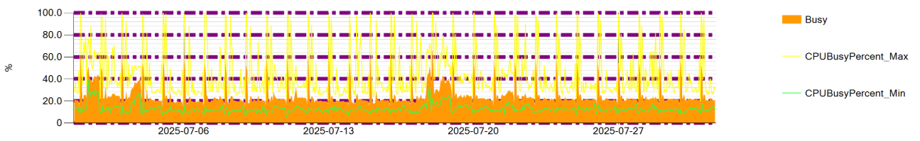
Here’s a simple example:
[LogicMonitor.Graph: device=mydevice, graphName=CPU Usage, dataSourceInstanceName=WinCPU, yAxisMajorGridLineColor=Purple, yAxisMajorGridLineWidth=10, yAxisMajorGridLineDashStyle=DashDot]
As expected, this sets the major grid lines of the y-axis to purple, using the DashDot style and sets a line width of 10 pixels - a rather unlikely example of course just for illustrative purposes!