In an upcoming minor release of ReportMagic 3.21, we have introduced some new customisation options to the various Analysis macros (such as [LogicMonitor.AlertAnalysis:] and [Agent.SqlAnalysis:]). These macros output to Excel and produce a pivot table and pivot chart based on the acquired data.
Current Example
The macros already produce 2 worksheets in each output XLSX:
- One for the raw data (“fact table”)
- One for the pivot table and chart
Here’s one example macro (before the new additions) that would be put into a Word document template. This example obtains LogicMonitor audit logs and includes a start and end date filter to limit the amount of data returned (Excel can only handle 1 million rows, so it can be important to apply certain filters if the amount of data would otherwise be huge):
[LogicMonitor.LogAnalysis: startDate=2025-01-01 00:00:00, endDate=2025-02-01 00:00:00]
Documentation for this macro can be found here (check back again in a few weeks for the updated help described in this post).
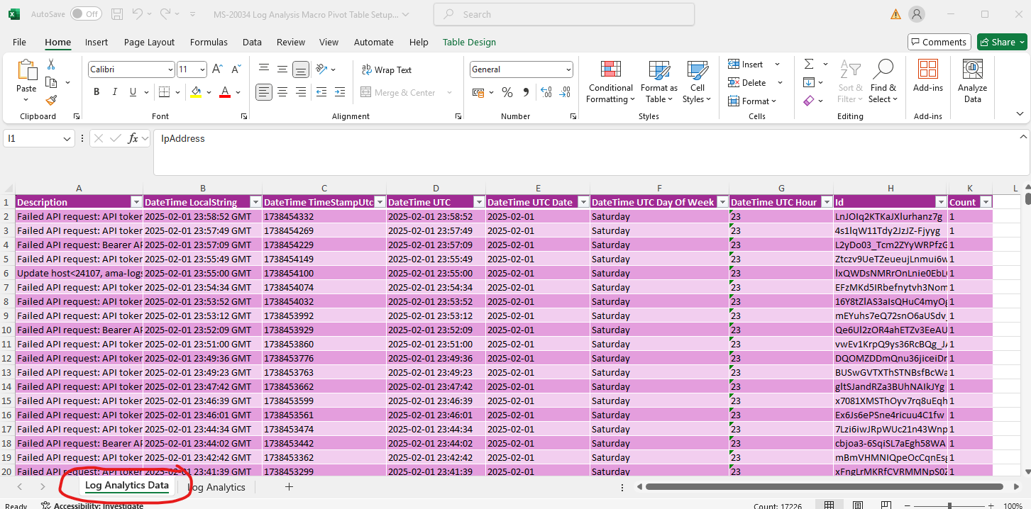
Here’s the raw data in the output worksheet. This is commonly called the “fact table”:
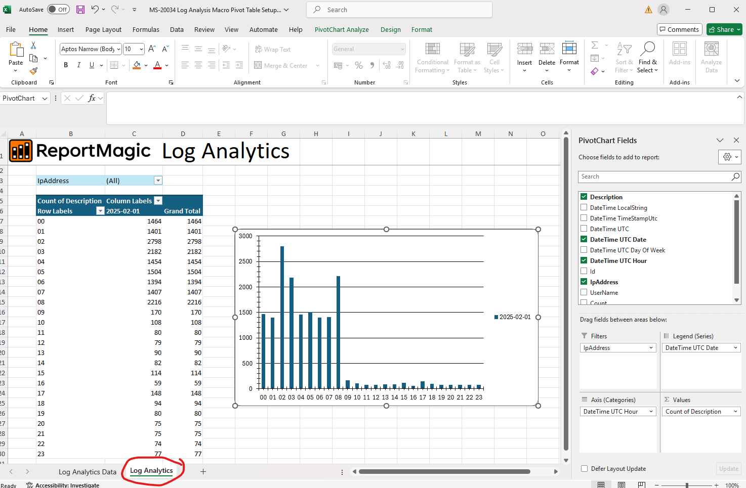
And here’s the corresponding analysis worksheet (it’s not a particularly realistic example of the type of chart you might want to see, but you get the idea…).
The macros already enable you to take a deep dive into your output data, and to then slice and dice it in numerous ways, but until now it’s been a manual process to configure the pivot table/chart by opening the XLSX in Excel, in order to obtain the analysis desired.
Affected Macros
The macros in question, which can all output to Excel are:
- [Agent.SqlAnalysis:]
- [Jira.IssueAnalysis:]
- [List.Analysis:]
- [LogicMonitor.AlertAnalysis:]
- [LogicMonitor.InstanceAnalysis:]
- [LogicMonitor.LogAnalysis:]
- [LogicMonitor.ResourceAnalysis:]
- [LogicMonitor.ResourceGroupAnalysis:]
- [LogicMonitor.WebsiteGroupAnalysis:]
- [Sql.Analysis:]
New Parameters
We’ve added several new parameters to configure the rows, columns, filters and values in Excel, right in the macro itself.
This means when you open the Excel file, the table and chart can be pre-configured giving you exactly the view into the data needed - with minimal configuration.
These are the new parameters, each of which can take a list (by default a semi-colon separated list of field names):
- pivotTableColumnFields
- pivotTableFilterFields
- pivotTableRowFields
- pivotTableValueFields
These correspond to the PivotTable Fields UI in Excel as follows:
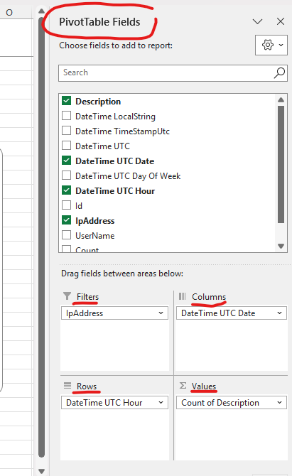
Here’s how they can be used:
[LogicMonitor.LogAnalysis: pivotTableColumnFields=DateTime UTC Date, pivotTableFilterFields=IpAddress, pivotTableRowFields=UserName, pivotTableValueFields=Description]
If you want to specify multiple fields e.g. multiple columns, you can use the parameters like so:
pivotTableColumnFields=Field1;Field2;Field2
e.g.
pivotTableColumnFields=Description;IpAddress;UserName
You can use any of the heading names from the fact table (described in the help for each macro) in these parameters.
Note: the Values fields only support the Count aggregation for now, which is shown in Excel as “Count of fieldname” such as:
Count of Description
Further Enhancements
Whilst these changes should benefit users wishing to have much more control and automation of their XLSX reports, further enhancements are coming in the near future - e.g. the ability to use different aggregations in the Values e.g.
- Sum
- Count
- Average
- Max
- Min
- Product
- and more…
…in addition to the ability to sort columns, add items to the filters, different types of formatting and presentation options, and much more.
For the moment, I hope these additions make the macros a bit more useful, but stay tuned for more updates in the near future.