Line charts are familiar for charting many ‘continuous’ variable metrics such as, say cpu or disk space consumption:
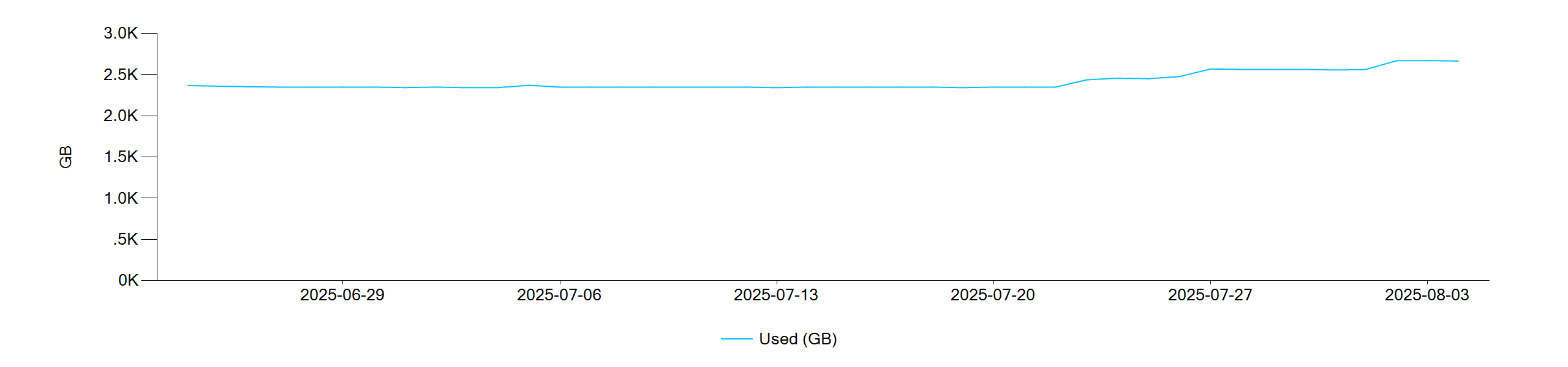
What about ‘slowly changing dimensions’ such as total disk space?
If ‘Total (GB)’ is added to the chart as another Line chart and an extra TB is added on Aug 1st, the result is as below (ok):

With a Step Line chart, it looks like this (better):
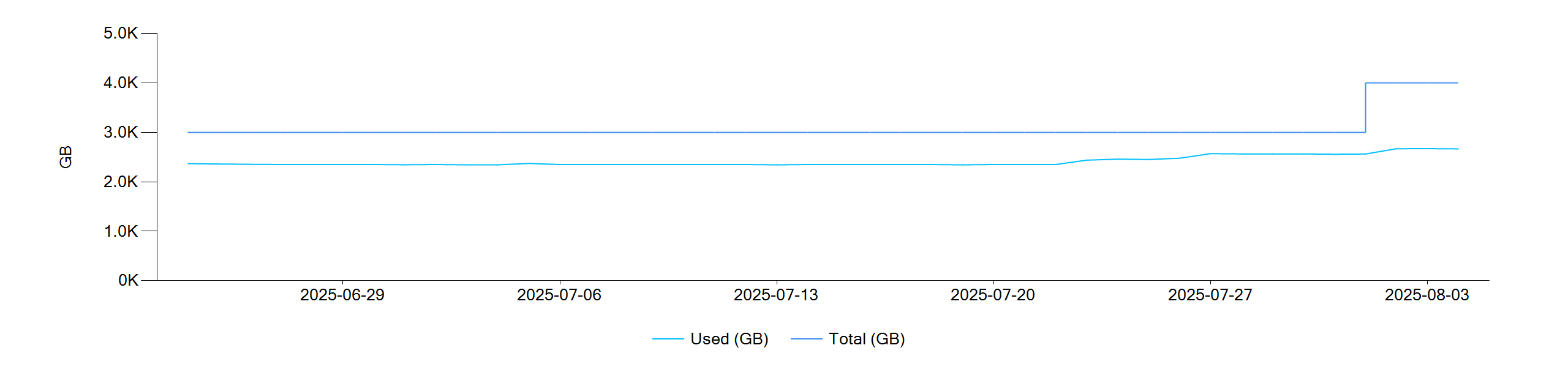
Notice the ‘step’ on Aug 1st, a much better representation of what happened in reality.
Where else can it be used?
Another use case is for ‘sparse’ data such as an availability monitor where data points are only returned for state changes (1 = available, 0 = not available).
An entire month of raw data could look like this (a ‘blip’ on 8th, and a longer outage on the 21st):
| DateTime | Status |
|---|---|
| 2025-09-24 12:34:57 | 1 |
| 2025-10-08 06:16:27 | 0 |
| 2025-10-08 06:16:57 | 1 |
| 2025-10-21 03:42:27 | 0 |
| 2025-10-21 15:17:57 | 1 |
A Line chart would look like (confusing?):

A Step Line chart would look like (better):
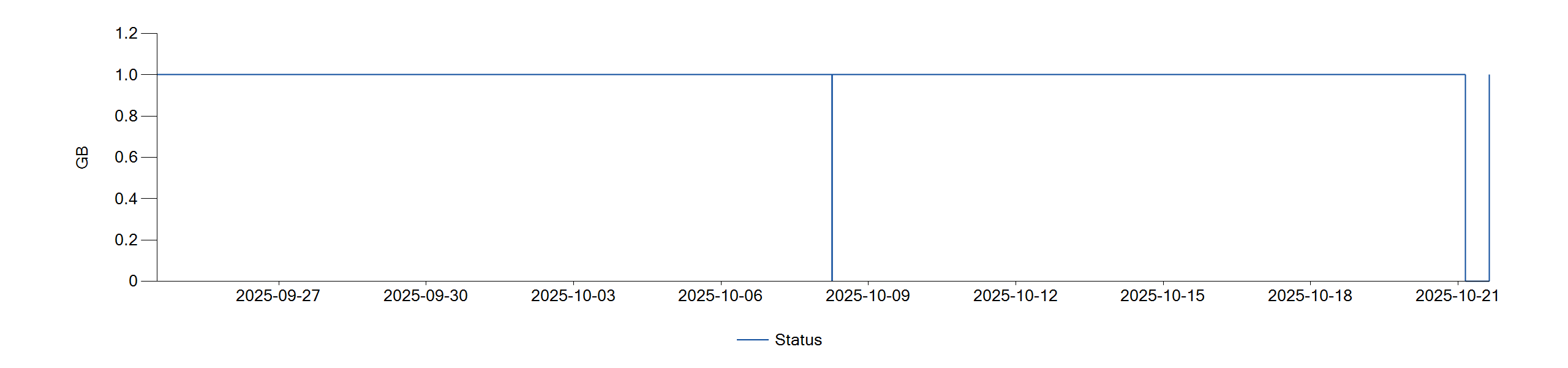
And with alignment to the month boundaries (even better!):

How can I use it?
Even today, some common reporting tools, such as Excel, do not directly support Step Line charts. There are many articles on the Web explaining how to synthesize Step Line charts using Line charts - which typically involves duplicating the time-series values with time-shifted data points – all quite tedious, error-prone and time-consuming… I have spent many hours over the years doing exactly that so I was very encouraged to see that: ReportMagic supports this out-of-the-box!
The charting macros such as [List.Graph:] support the chartTypes parameter, with permitted values:
- Point, FastPoint, Line, Spline, StepLine, FastLine, Bar, StackedBar, StackedBar100, Column, StackedColumn, StackedColumn100, Area, SplineArea, StackedArea, StackedArea100, Pie, Doughnut, Radar, Polar, BoxPlot, Funnel, Pyramid
(See the [List.Graph:] documentation for a fuller description: ReportMagic Macros - List List.Graph)
By simply adding chartTypes=StepLine, to the macro specification, it saves all the extra work of creating time-shifted duplicate datapoints.
And to align to the reporting boundaries for sparse data?
Given an array of sparse datapoints ready for [List.Graph:], code of the following form is quick and easy to implement:
// Align first datapoint if prior to report boundary
[=: `select(datapoints, 'd',
       'list(
            (if(itemAtIndex(d, 0) < StartDate, StartDate, itemAtIndex(d, 0)),
                itemAtIndex(d, 1)
       )'
    )`,
    => datapoints
]
// Add datapoint for end of report boundary
[=: `list(EndDate, itemAtIndex(last(datapoints), 1))`, =>finalState]
[List.Add: value={=finalState}, =>datapoints]
And there you have it.
Step Lines - Another useful nugget for making your reporting look even more impactful.
Any questions on usage, please post here…