Are you monitoring your AlertMagic integration performance? The [AlertMagic.MetricsGraph:] macro is a powerful ReportMagic tool that helps you visualize how your alert processing pipeline is performing over time. Whether you’re tracking notification throughput, incident creation rates, or API call success rates, this macro provides the insights you need.
What Does It Do?
The [AlertMagic.MetricsGraph:] macro generates visual charts showing aggregated metrics from your AlertMagic integrations. It pulls data directly from the AlertMagic metrics system and presents it as professional-looking graphs that can be embedded in Word documents, HTML reports, or even Excel spreadsheets.
Key Metrics Available
The macro tracks a comprehensive set of metrics across your alert processing pipeline:
Input Metrics:
- Processed Notifications - Successfully processed incoming alerts
- Malformed Notifications - Alerts that couldn’t be parsed
- Discarded Notifications - Alerts filtered out by your rules
Output Metrics:
- Incidents Created - New tickets created in your Incident Management System (IMS)
- Incidents Updated - Existing tickets updated
- Problems Created - Problem records created
- Problems Updated - Problem records updated
Integration Health:
- Successful/Failed AMS Reads - Alert Management System API read operations
- Successful/Failed AMS Writes - Alert Management System API write operations
- Successful/Failed IMS Reads - Incident Management System API read operations
- Successful/Failed IMS Writes - Incident Management System API write operations
- Total Processing Failures - Overall processing errors
Flexible Time Granularity
You can aggregate your metrics at three different time scales:
- Hourly - Perfect for monitoring recent activity and identifying patterns during the day
- Daily - Great for weekly or monthly trend analysis
- Monthly - Ideal for long-term capacity planning and quarterly reviews
Example Use Cases
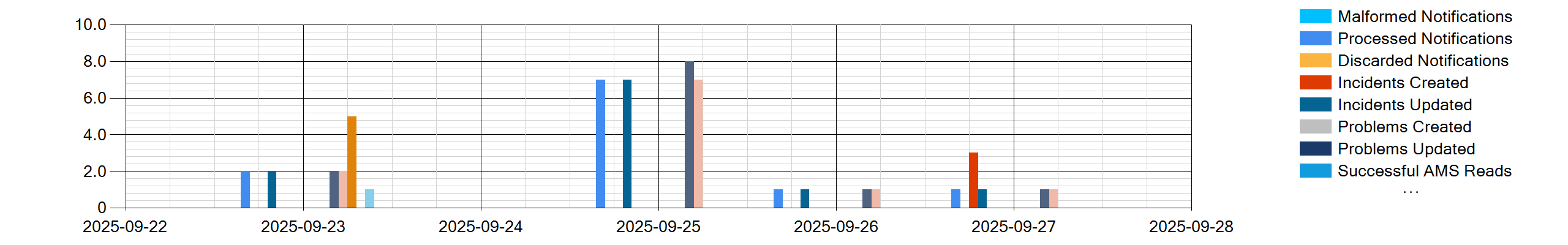
1. Simple Daily Overview
Get a quick daily snapshot of all metric types for the past month:
[AlertMagic.MetricsGraph: granularity=Daily, metricTypes=All]
This uses sensible defaults: the last calendar month as the date range, daily aggregation, and all available metrics. Here’s an example of the output:
2. Focused Incident Tracking
Track just incident creation and updates with custom colors:
[AlertMagic.MetricsGraph:
    startDate=2025-01-01 00:00:00,
    endDate=2025-02-01 00:00:00,
    metricTypes=IncidentsCreated;IncidentsUpdated,
    granularity=Hourly,
    palette=Incidents Created^limegreen;Incidents Updated^skyblue,
    title=January Incident Activity]
This creates an hourly chart showing only incident-related metrics with a custom color scheme.
3. Success vs Failure Analysis
Monitor the health of your Alert Management System API calls:
[DateTime: format=yyyy-MM-dd HH:mm:ss, dateOnly=true, day=1, =>MonthStart]
[DateTime: value={MonthStart}, addMonths=-1, format=yyyy-MM-dd HH:mm:ss, =>LastMonthStart]
[AlertMagic.MetricsGraph:
    startDate={LastMonthStart},
    endDate={MonthStart},
    granularity=Monthly,
    metricTypes=SuccessfulAMSReads;SuccessfulAMSWrites;FailedAMSReads;FailedAMSWrites,
    palette=Successful AMS Reads^#82e0aa;Successful AMS Writes^#58d68d;Failed AMS Reads^#d0ece7;Failed AMS Writes^#a2d9ce]
This generates a monthly view comparing successful vs failed API operations with a custom green-to-red color palette.
4. Integration-Specific Reporting
Filter metrics to a specific integration and version:
[DateTime: format=yyyy-MM-dd HH:mm:ss, dateOnly=true, day=1, =>End]
[DateTime: value={End}, addMonths=-1, format=yyyy-MM-dd HH:mm:ss, =>StartDate]
[AlertMagic.MetricsGraph:
    startDate={StartDate},
    endDate={End},
    integrationId=5,
    versionId=12,
    title=ServiceNow Integration Performance]
Perfect for tracking specific integrations independently.
5. Excel Export Support
Generate both a visual chart AND an Excel spreadsheet with the raw data:
[AlertMagic.MetricsGraph:
    monthsToReport=6,
    worksheetName=6 Month Metrics,
    writeToSpreadsheet=true,
    xlsxTableStyle=TableStyleLight7]
When this runs in a Word-based report with XLSX output enabled, you’ll get both visual and tabular representations of your data.
6. Long-Term Trend Analysis
Track metrics over a full year with monthly granularity:
[DateTime: format=yyyy-MM-dd HH:mm:ss, dateOnly=true, day=1, =>Today]
[DateTime: value={Today}, addMonths=-12, format=yyyy-MM-dd HH:mm:ss, =>YearAgo]
[AlertMagic.MetricsGraph:
    startDate={YearAgo},
    endDate={Today},
    granularity=Monthly,
    metricTypes=All,
    title=Annual AlertMagic Performance,
    yAxisInterval=100]
Customization Options
The macro offers extensive customization:
- Date Ranges: Use any start and end date, or leverage shortcuts like
monthsToReport - Chart Appearance: Control width, height, titles, and axis intervals
- Color Palettes: Define custom colors using the
paletteparameter with hex codes or color names - Output Formats: Embed in documents or export to Excel
- Variable Storage: Store chart images as base64 variables for use elsewhere in your report
Pro Tips
-
Palette Syntax: When specifying custom colors in the
paletteparameter, use the display names (with spaces) not the enum names. For example:"Incidents Created^blue"not"IncidentsCreated^blue" -
Combine with DateTime Macros: Use the
DateTimemacro to dynamically calculate date ranges relative to the report execution time -
Performance Monitoring: Set up scheduled reports that automatically email stakeholders with weekly or monthly metric charts
-
Comparative Analysis: Generate multiple graphs with different time granularities in the same report to show both detail and trends
When to Use This Macro
The [AlertMagic.MetricsGraph:] macro is perfect for:
- Operations Reviews - Include in monthly or quarterly ops reports
- Capacity Planning - Identify growth trends and plan scaling
- Integration Health Checks - Monitor API success rates and processing failures
- SLA Reporting - Track ticket creation and update volumes
- Incident Response Analysis - Correlate alert volumes with incident creation patterns
- Troubleshooting - Identify when failures or anomalies occurred
Limitations
Currently, custom metrics (Dimension 1, 2, and 3) shown in AlertMagic’s UI are not yet supported by this macro, but standard metrics cover the vast majority of monitoring use cases.
Getting Started
Try starting with a simple example:
[AlertMagic.MetricsGraph: granularity=Daily, metricTypes=All, title=My First Metrics Chart]
Then gradually add customization as you become familiar with the available parameters.
More details can be found in the Docs app here.
Have questions about using the [AlertMagic.MetricsGraph:] macro? Share your use cases or examples in the comments below!